1. Correction
23 March 2015, 5:00pm
An error has been found in the analysis underlying Figures 10 and 11, which examine the distribution of real earnings growth over time. Data for 2013 and 2014 are affected. In Figure 10, the median growth rate of real earnings among those in continuous full-time employment in 2013 has been revised down, from -0.2% to -0.4%. The median growth rate of real earnings in 2014 for this group has been revised up, from 0.3% to 0.6%. All other years are unchanged.
As a result, the fraction of those in continuous full-time employment who experienced a rise in real earnings (shown in Figure 11) has fallen from 45% to 43% in 2013, and risen from 48% to 50% in 2014.
ONS has now corrected these and apologises for any inconvenience that this may cause.
Back to table of contents2. Main points
The second estimate of Gross Domestic Product (GDP) confirmed that the UK economy grew by 0.5% in the final quarter of 2014, and by 2.6% in 2014 as a whole, the fastest annual rate since 2007.
While household spending and investment have both contributed strongly to the economic recovery since Q1 2013, growth in investment has moderated recently, partly as a consequence of lower investment in the oil and gas industries.
Despite sustained economic growth and a tightening labour market, consumer price inflation has fallen to a record low.
The level of UK productivity remains low by international standards: the level of output per hour in the UK remained 17 percentage points below the average level in the G7 economies as a whole in 2013.
ONS analysis indicates that close to 60% of matched full-time workers experienced a fall in real hourly earnings in 2010 and 2011 – up from around 31% on average during the previous eight years. However, the latest data (for the year to April 2014) suggest that 50% of these workers received a rise in their real earnings in 2014 – the largest fraction since 2009.
3. Introduction
The second estimate of Gross Domestic Product (GDP) confirmed that the UK economy grew by 0.5% in Q4 2014: slightly slower than in previous quarters. Nevertheless, this resulted in growth of 2.6% as a whole in 2014, the fastest annual rate since 2007. This edition of the Economic Review considers which components of expenditure have contributed most to growth since 2013, and the impact of lower investment in the oil and gas industries on aggregate investment growth in particular.
Despite the relatively strong recent economic performance – which is reflected in improving labour market data – UK price inflation has fallen to a record low. This development is partly due to lower oil prices which have also served to lower both input and output prices within the manufacturing supply chain. CPI inflation excluding energy, food, alcohol and tobacco – also known as ‘core’ inflation – has also moderated in recent months, but remains well above the Consumer Prices Index (CPI) rate of inflation, making judgements about the underlying degree of inflation in the UK economy more difficult. Given the challenge of assessing underlying inflationary pressure, productivity measures can help to shed some light on the degree of spare capacity in the economy. Recent UK productivity performance remains weak relative to other G7 countries.
However, the growth of both productivity and earnings has started to recover in recent months. This edition of the Economic Review presents an analysis of the Annual Survey of Hours and Earnings data which suggests that close to 60% of matched full-time workers experienced a cut in real hourly earnings in 2010 and 2011 – up from around 31% on average during the previous eight years. However, this trend has started to reverse in recent times. The latest data (for the year to April 2014) suggest that 50% of matched full-time workers received a rise in their real earnings in 2014 – the largest fraction since 2009. Much of this recent strength may be derived from a pick up in the rate of job to job moves between full-time posts.
Back to table of contents4. Gross Domestic Product (GDP)
The second estimate of Gross Domestic Product (GDP) indicated that the UK economy grew by 0.5% in the final quarter of 2014, unrevised from the preliminary estimate. Following output growth of 0.8% and 0.7% in the second and third quarters of 2014, the UK is estimated to have grown by 2.6% in 2014 as a whole: the fastest annual rate since 2007.
The second estimate of GDP also contained the first information on the expenditure components of GDP for the final quarter of 2014. Following recent trends, quarterly growth was largely driven by stronger household spending, which was 0.5% higher in the final three months of 2014 than in the previous quarter. Net trade also made a substantial contribution, as the volume of exports increased by 3.5% compared with slower growth of 1.3% in imports. Comparing Q4 2014 with the same period a year ago (Figure 1), household spending accounted for just over half of the growth of total expenditure, while net trade (19%), investment (15%) and government (15%) accounted for more modest proportions.
Figure 1: Contributions to growth in the expenditure measure of GDP, quarter on same quarter a year ago, chained volume measure, seasonally adjusted
Source: Office for National Statistics
Notes:
- Other includes the statistical discrepancy. HHFCE is household final consumption expenditure. NPISH is non-profit institutions serving households
Download this chart Figure 1: Contributions to growth in the expenditure measure of GDP, quarter on same quarter a year ago, chained volume measure, seasonally adjusted
Image .csv .xls5. Investment and household consumption
While household consumption has consistently supported expenditure growth in recent quarters, the mix of drivers has varied during the recovery. Figure 2 shows the average quarterly growth rates for each of the high-level components of the expenditure measure of GDP during two phases of the economic recovery: between the trough of the downturn in Q2 2009 and Q1 2013 (dark blue bars), and between Q1 2013 and Q4 2014 (light blue bars) – the latter reflecting a more sustained period of economic growth. It shows that while each of the expenditure components have grown in both phases of the economic recovery, the increased pace of the recovery in the later period reflects a mixture of stronger household spending, investment and government expenditure. The average quarterly growth rate of household consumption – which accounts for around two-thirds of GDP – increased from around 0.2% to around 0.5% between these two phases, while investment increased from just under 1.0% to 2.4% per quarter. Imports – which count negatively towards GDP growth – also accelerated during this second phase of the recovery, outstripping the growth of exports – which count positively towards GDP growth. As a consequence, the contribution of net trade is estimated to have been zero in 2013 and negative during 2014.
Figure 2: Average quarterly growth rates of the expenditure components of GDP during the recovery, chained volume measure, seasonally adjusted

Source: Office of National Statistics
Notes:
- HHFCE is household final consumption expenditure. NPISH is non-profit institutions serving households.
While investment may have accounted for a large fraction of the stronger GDP growth since Q1 2013, its contribution has moderated in recent quarters, which may partly reflect the relatively more volatile nature of this component. As is shown in Figure 1, stronger investment helped to drive GDP growth during the second half of 2013 and the early part of 2014. Stronger capital formation – as firms sought either to increase their capacity to meet growing demand or to replace their ageing capital base – contributed around 2.5 percentage points to annual GDP growth to Q1 2014. However, this effect has waned in recent quarters. Investment is estimated to have added just 0.4 percentage points to annual growth in Q4 2014 and Gross Fixed Capital formation (GFCF) fell by 0.5% on the quarter. Business investment – which has now contracted for two consecutive quarters – fell by 1.4% in the final three months of 2014: the largest quarterly fall since Q2 2009.
Much of this recent fall is accounted for by lower investment by the oil and gas industries, which is likely to reflect both the impact of sharply lower oil prices and the timetabling of maintenance. The fall in the oil price in particular may have influenced the incentives to develop new oil and gas fields, as the lower price may mean that some potential new field developments have become uneconomical. Figure 3 presents the quarterly growth rate of business investment since Q2 2012 alongside indicative estimates of the growth of business investment excluding activity in the oil and gas industry. Although this industry varies in its impact over this period – sometimes raising total investment growth, lowering it on other occasions – it acted as a substantial break on aggregate investment in Q4 2014. While total business investment fell by 1.4% in Q4 2014, excluding oil & gas the fall was a more modest 0.3%. GFCF – which declined 0.5% in total in Q4 2014 – grew by 0.2% on this alternative basis. However, while the fall in oil and gas investment explains a large part of the recent slowdown, Figure 3 makes clear that it is not the sole cause of the weakness of investment: there was also a broader slowing of investment activity in the second half of 2014 beyond the oil and gas industries.
Figure 3: Growth of business investment: Including and excluding oil and gas, quarter on quarter, chained volume measure, seasonally adjusted
Source: Office for National Statistics
Notes:
- Indicative estimates of business investment excluding oil & gas were estimated from the current price investment in this industry by asset, not seasonally adjusted, from the Quarterly Survey of Capital Expenditure (Capex). These estimates were deflated by Capex asset using the headline asset implied deflators (buildings & transfer costs, other machinery & equipment, transport equipment and intellectual property products), and subtracted from the total estimate of business investment chained volume measure, seasonally adjusted. This approach includes two approximations. First, no adjustment for seasonality has been made to investment in the oil and gas industry. Secondly, no adjustment was made to the headline implied deflators to account for the differences in the weights of Capex assets relative to the headline assets. As a result, the estimates presented may differ from the ‘true’ picture to the extent that the implied deflators are sensitive to movements in the Capex asset mix, and to the extent that the seasonal patterns of oil and gas investment have not been accounted for in the subtraction. Consequently, they should be regarded as indicative and treated appropriately. ONS will publish a breakdown of investment by asset and industry in the Business Investment Q4 2014 Revised release alongside the Quarterly National Accounts on 31 March 2015.
Download this chart Figure 3: Growth of business investment: Including and excluding oil and gas, quarter on quarter, chained volume measure, seasonally adjusted
Image .csv .xlsThe relative weakness of investment towards the end of 2014 was largely offset by the continued growth of household spending and a positive contribution from net trade (Figure 1). Indeed, while retail sales volumes fell slightly during the first month of 2015, sales in the three months to January 2015 were stronger than usual. Taking sales over this longer period – including ‘Black Friday’ in November and the run up to Christmas with the January sales – is likely to permit a fairer comparison of how consumer spending has varied over recent months than any single monthly estimate. The growth in the volume of sales in this period compared to the previous three months was among the strongest outturns since 2002. Figure 4 compares the level of retail spending excluding fuel during these three months with the level in the preceding nine months (February-October) each year since 1989. On average over this period, the volume of spending in retail outlets is around 15.5% higher during the festive period than during the preceding nine months. However, the uplift this year rose to 17%: the highest uplift since 2003.
Figure 4: Volume of retail sales excluding fuel: ‘festive premium’

Source: Office for National Statistics
Notes:
- Chart shows the percentage difference between the average volume of the retail sales index excluding fuel from November to January, and its average volume in the preceding nine months. Higher (lower) percentages indicate stronger (weaker) spending during the festive period than during the rest of the year. The chart is normalised to the average ‘festive premium’ for the 1989-2014 period (15.5%).
6. Labour market tightening and inflation
The recent economic recovery has also had a marked impact on the labour market, which has started to tighten on a broad range of different measures. In particular, the level of unemployment has fallen quite sharply since the onset of a more sustained economic recovery at the start of 2013. Over this period, the rate of unemployment among those aged 16 and above has fallen from 7.8% in the three months to March 2013 to just 5.7% in the three months to December 2014, with particularly large falls among those who have been unemployed for less than six months (Figure 5). This rate of short-term unemployment has now fallen back below its pre-downturn level, while the other, longer term categories are approaching their earlier averages. The transition rate from unemployment to employment has also recovered relatively strongly during 2014, regaining much of the ground lost during the downturn.
Figure 5: Unemployment rate by duration of unemployment, %

Source: Office for National Statistics
Notes:
- Increases in the short-term unemployment rate will only feed into increases in the medium- and long-term unemployment rates with a lag. This accounts for the apparent ‘wave’ structure of the unemployment rates by duration. A similar phenomenon may be observed as unemployment rates fall, although this need not be the case if the flow out of long-term unemployment picks up contemporaneously with that from short-term unemployment.
- Rates are calculated as the percentage of those economically active (aged 16+). The economically active population is defined as those in employment plus those who are unemployed.
- 2002-2007 average covers the period between and inclusive of Jan-Mar 2002 to Oct-Dec 2007.
The sharp fall in the unemployment rate is in stark contrast to the very gradual fall in unemployment experienced following the previous economic downturn in the early 1990s. Higher unemployment persisted through much of the 1990s, only falling to an average rate of around 5.1% between 2002 and 2007. As a result of this slow adjustment process, the fraction of the unemployed who had been out of work for more than a year increased relatively sharply during the 1990s, leading to an increased loss of human capital through skill atrophy. The more recent relatively rapid fall in unemployment – which has not just been limited to workers who have recently been made unemployed – has helped to ensure that the fraction of the unemployed who have been out of work for more than a year appears to have peaked at a lower level, and has started to decline.
While the strength of the recovery, the sharp decline in the unemployment rate and the tightening of the labour market on a range of different measures might be viewed as forebears of potential inflationary pressure, the rate of consumer price inflation fell to a record low of 0.3% in January (Figure 6). Consumer price pressure is now lower than at any point in the history of the official or constructed CPI series, and is estimated only to have been lower during one spell in the past half-century: at the end of the 1950s, following the return to convertibility under the Bretton Woods system and an associated decline in import prices. Lower motor fuel and food prices accounted for much of the recent fall in the headline rate – reflecting the weakness of oil prices, competition for market share among food stores, and the recent appreciation of Sterling.
Figure 6: Consumer Price Inflation: Official, estimated and modelled: 1950-2015

Source: Office for National Statistics
Notes:
- The official CPI series dates back to 1996, allowing official annual inflation rates to be produced from 1997 onwards. The estimated CPI series runs between 1988 and 1996, and is calculated using observed price quote data. The modelled CPI – which accounts for the observations between 1950 and 1988 – was produced by ONS methodologists using an ARIMA model and other available data.
These factors have also played an important part in determining the costs faced by manufacturing firms. The lower cost of oil and fuels, as well as downwards price pressure from imported products have been reflected in the prices paid by manufacturing firms for their inputs (input prices) and in the prices they charge for their products (output prices) (Figure 7). Both input and output price inflation for manufacturing firms have been moderating since 2011, and both price indices started to fall during 2014. Input price inflation is close to, and output price inflation is already at, a record low, underlining the impact of these disinflationary pressures.
Figure 7: Input and output price inflation for UK manufacturing, %

Source: Office for National Statistics
The strength of these disinflationary forces presents a particular challenge for assessing the ‘underlying’ strength of inflationary pressure. Consumer Prices Index (CPI) inflation excluding energy, food, alcohol and tobacco – sometimes referred to as ‘core’ inflation - has also moderated in recent months. However, at an annual rate of 1.4% it remains well above the headline measure, and there is substantial uncertainty about the degree to which lower input costs will be passed through to consumers. These uncertainties in turn make it difficult to set macroeconomic policy, and in particular to set monetary policy consistent with achieving the Bank of England’s 2% target rate.
Back to table of contents7. International comparisons of labour productivity
Given the difficulty of assessing the underlying rate of inflation, measures of productivity growth take on particular significance. Stronger productivity growth could indicate that the economy can continue to grow without bidding up the price of factor inputs, while the absence of a recovery in output per hour may indicate the opposite.
Although the slowdown in productivity growth experienced in the UK is broadly representative of international experience, ONS analysis has highlighted that there remains a substantial gap between the UK’s performance and that of its international trading partners1. While economic growth in the UK has recently outperformed many G7 economies2, productivity continues to lag well behind in level terms. The latest estimates for 2013 indicate that UK labour productivity (as measured by output per hour worked) was 17 percentage points below the average for the rest of the G7 economies: the widest productivity gap on an output per hour basis since 1992. On this measure, labour productivity among the G7 nations was highest in the US: only Japan’s performance was weaker than that of the UK in 2013. Comparing 2013 to 2012, Figure 8 shows that the UK productivity shortfall to Canada and the US increased, while it remained unchanged relative to other G7 countries on an output per hour basis.
Figure 8: GDP per hour worked, G7 countries

Source: Office for National Statistics
UK productivity remains marginally below its pre-crisis level, and has declined since 2011 to around 16 percentage points below the path predicted by its 1997-2007 average growth path. In comparison, the remaining G7 countries have on average seen productivity rise to around 5 percentage points above their 2007 levels, around 6 percentage points below those predicted had their pre-crisis trends been maintained to 2013.
Notes for international comparisons of labour productivity
Care should be taken when comparing productivity across countries. Estimates of GDP and labour inputs are sourced from the OECD, converting local currency based measures of GDP using purchasing power parity (PPP) exchange rates. PPPs attempt to equalise the cost of a representative basket of goods and services in countries with different national currencies but do not do so perfectly.
G7 developed countries are defined as Canada, France, Germany, Italy, Japan, UK and US
8. The distribution of real wage growth
While the UK’s level of productivity remains below that of the G7 as a whole in 2013, output per hour growth recovered slightly towards the end of 2014. On this measure, productivity was 5.2% higher in manufacturing in Q3 2014 than in the same period a year earlier, and 0.8% higher in the services industries. This recent revival of productivity growth has been accompanied by a return to real wage growth. Figure 9 shows the growth of average weekly earnings (AWE) alongside the rate of CPI inflation, and the resulting employee real wage growth series. Although this recent rise in real wages owes as much to lower rates of inflation as it does to stronger nominal wage growth, on this measure real wages have now risen for four consecutive months. Over a longer time period, movements in real wages on this measure are matched by findings based on the Annual Survey of Hours and Earnings (ASHE), also plotted on Figure 9. These data suggest that median real earnings fell between 2009 and 2013. The most recent ASHE data (for April 2014), suggest that real earnings fell by 1.6% between 2013 and 2014, a movement partly explained by changes in the composition of the labour force over this period.
Figure 9: Average annual real wage and real median earnings growth, nominal wages and CPI inflation, %

Source: Office for National Statistics
Notes:
- CPI is the rate of Consumer Prices Index inflation. It is shown as negative here to demonstrate the impact it has on real wages. AWE is the growth rate of nominal earnings. The growth in average real wages series is the AWE series deflated by the CPI. The growth in median real earnings series is the growth of median nominal weekly earnings from ASHE deflated by the CPI.
However, although mean real wage growth and median real earnings growth are good summary measures of developing labour market conditions, they mask variation in individual experiences. As workers move between posts, adjust their hours of work or experience changes in their pay, the earnings of some individuals will rise each period, while others will see their earnings fall. This more detailed perspective provides information about the degree of earnings pressure in different parts of the labour market, which in turn may help economists to understand how wage pressure builds up in the economy.
The remainder of this section is devoted to this more detailed analysis of the growth of real earnings. By necessity, it differs from that presented above in that it focuses on workers who are observed in each pair of years – which permits the calculation of earnings growth rates for individuals and the estimation of the median growth rate. Secondly, our analysis is limited here to individuals observed in full-time posts in each pair of years, so as to more closely inspect wage pressures for the majority of the labour force. Thirdly, we examine changes in real hourly earnings, taking account of changes in hours worked within the full-time category.
On this more detailed basis, the distribution of earnings growth is relatively broad and has varied substantially over time. Figure 10 shows the distribution of real hourly earnings growth for matched full-time employees for whom data is available from ASHE in each pair of years between 2002 and 2014, presented in the form of a ‘fan chart’. The orange line shows the median rate of earnings growth for these employees, while the shaded regions show the distribution of earnings increases, with the darker (lighter) areas denoting the centre (extremes) of the distribution. In times when the median growth rate is positive, a majority of these workers experienced an increase in their real earnings, and conversely when the median growth rate is negative, a majority of these workers experienced a reduction in their real earnings. The shaded regions consequently yield information about the variety of experiences of workers.
Figure 10: The distribution of real hourly earnings growth for full-time employees, 2002 to 2014

Source: Office for National Statistics
Notes:
- This chart uses individual level data from ASHE to calculate the growth of nominal hourly earnings for individuals observed in each pair of years. The rate of CPI inflation is subtracted from their nominal annual earnings growth to calculate individual level real earnings growth. Weighted summary statistics for the distribution of real earnings growth rates are calculated using their population weights in the second period, as longitudinal weights are not available for the ASHE survey at present. ONS is examining the feasibility of producing a set of longitudinal weights for ASHE that would permit more thorough analysis. Note that the ASHE methodology is not specifically designed to model earnings growth for individuals over time. As a result, the 10% highest and lowest earnings increases have been excluded in the Figure above. Note that the median presented here differs from that in an earlier figure: In particular, here we present the median earnings growth rate for full-time employees, while the earlier figure presents the growth of median earnings for all employees.
Download this image Figure 10: The distribution of real hourly earnings growth for full-time employees, 2002 to 2014
.png (34.3 kB)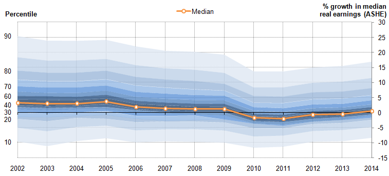
Perhaps the most striking feature of Figure 10 is the range of real earnings outcomes experienced by workers in each period. In 2002, for instance, when median real earnings grew by 3.2%, workers at the 90th percentile of the real earnings growth distribution saw their real earnings grow by more than 25%, while workers at the 10th percentile saw their earnings fall by just over 10%. These trends suggest that, while summary measures of earnings growth are useful, the range of actual earnings outcomes each period is relatively broad and may change in a manner which is difficult to distinguish from summary statistics.
Secondly, this range of full-time hourly earnings growth outcomes narrowed relatively sharply during the economic downturn, largely as a consequence of fewer workers experiencing substantial earnings rises. At the 10th percentile of the earnings growth distribution, real earnings contracted by around 10% per year throughout this period – likely reflecting full-time workers reducing their hours or moving from one position to another. However, real earnings growth at the 90th percentile fell gradually between 2005 and 2009, before falling sharply in 2010, as more workers found it difficult to achieve substantial real earnings growth. A large fraction of this fall may be explained by reduced job to job moves during the downturn, as risk-averse employees and employers changed their behaviour.
Thirdly, Figure 10 highlights the movement in the centre of the distribution of real earnings growth – denoted by the darkest blue area – which shifted lower during the economic downturn and is only now beginning to recover its former position. It shows that the recent fall in average real earnings was partly driven by this region shifting below the horizontal axis – a move from which the distribution was only starting to recover in April 2014.
Figure 11 examines this pattern in more detail by plotting the fraction of full-time employees who received differing degrees of real earnings growth each period: the red (blue) bars show the fraction of these workers receiving real earnings falls (increases) each period by the magnitude of their change in earnings. Those who experience earnings growth at a rate that is broadly comparable to the CPI – defined as half a percentage point either side of the headline rate of inflation – are categorised separately (grey bars).
Figure 11: Percentages of full-time employees by their rate of annual real hourly earnings growth, %
Source: Office for National Statistics
Notes:
- This chart uses individual level data from ASHE to calculate the growth of nominal hourly earnings for individuals observed in each pair of years. The rate of CPI inflation is subtracted from their nominal annual earnings growth to calculate individual level real earnings growth. Weighted summary statistics for the distribution of real earnings growth rates are calculated using their population weights in the second period, as longitudinal weights are not available for the ASHE survey at present. ONS is examining the feasibility of producing a set of longitudinal weights for ASHE that would permit more thorough analysis. Note that the ASHE methodology is not specifically designed to model earnings growth for individuals over time.
Download this chart Figure 11: Percentages of full-time employees by their rate of annual real hourly earnings growth, %
Image .csv .xlsThis analysis shows that close to 60% of full-time employees experienced a fall in real hourly earnings in 2010 and 2011 – almost double the average of just 31% during the preceding eight years. Conversely, the fraction of full-time workers experiencing a rise in hourly earnings dropped markedly in these years – falling from an average of 63% to just 35% over the same period. Much of this movement is accounted for by shifts around the centre of the distribution. The fraction of workers experiencing real earnings falls of more than 10% changed relatively little between 2010 and 2012: the majority of the distributional shift came as a consequence of more workers experiencing more moderate falls in real earnings of between 2% and 5%. At the top of the earnings growth distribution, the fraction experiencing above 10% earnings growth fell slightly, as did the more moderate real earnings growth categories.
This more detailed analysis also provides some evidence that wage growth started to pick up between 2011 and 2014. The fraction of full-time workers achieving a real hourly earnings increase has grown slightly each year over this period, rising from 34% in 2011 to just over 50% in 2014. Conversely, the fraction experiencing a real pay fall has come down each year since 2011, driven largely by a decrease in the number of workers experiencing moderate real earnings falls of between 2% and 5%. Much of the explanation for the recent recovery of earnings growth – and its earlier fall – may lie with the number of job to job moves being undertaken (Figure 12). The recent recovery of moves between different full-time positions may indicate that workers are increasingly able to access opportunities elsewhere to boost their real earnings. ONS plans to publish a complementary piece of analysis, examining the characteristics of those who remain in the same job between years in more detail in the coming months.
Figure 12: Rate of job to job flows among people moving between full-time positions, %, four quarter moving average
Source: Office for National Statistics
Notes:
- Chart shows the number of employees moving from a full-time post to another full-time post, expressed as a fraction of the total number of full-time employees. This series is then averaged across four quarters to deliver the series as presented. ‘Movers’ in each quarter are defined as individuals who report having been with their current employer for less than three months
Download this chart Figure 12: Rate of job to job flows among people moving between full-time positions, %, four quarter moving average
Image .csv .xls9. Reference tables
Table 1: UK Demand side indicators
| 2013 | 2014 | 2014 | 2014 | 2014 | 2014 | 2014 | 2014 | 2015 | |
| Q2 | Q3 | Q4 | Oct | Nov | Dec | Jan | |||
| GDP1 | 1.7 | 2.6 | 0.8 | 0.7 | 0.5 | : | : | : | : |
| Index of Services | |||||||||
| All Services1 | 1.9 | 3.0 | 1.0 | 0.8 | 0.8 | 0.2 | 0.1 | 0.6 | : |
| Business Services & Finance1 | 2.5 | 3.7 | 1.2 | 0.9 | 0.9 | 0.3 | 0.0 | 0.7 | : |
| Government & Other1 | 0.3 | 1.1 | 0.4 | 0.3 | 0.0 | 0.1 | -0.3 | 0.4 | : |
| Distribution, Hotels & Rest. 1 | 3.5 | 4.7 | 1.1 | 0.8 | 1.3 | 0.1 | 0.8 | 0.5 | : |
| Transport, Stor. & Comms. 1 | 1.4 | 2.8 | 1.6 | 1.3 | 1.3 | 0.6 | -0.1 | 0.9 | : |
| Index of Production | |||||||||
| All Production1 | -0.5 | 1.4 | 0.3 | 0.1 | 0.1 | -0.2 | 0.0 | -0.2 | : |
| Manufacturing1 | -0.7 | 2.7 | 0.6 | 0.4 | 0.2 | -0.7 | 0.8 | 0.1 | : |
| Mining & Quarrying1 | -2.5 | -0.2 | 0.2 | -2.3 | 0.5 | 1.5 | -2.9 | -1.4 | : |
| Construction1 | 1.4 | 7.3 | 1.8 | 2.0 | -2.1 | -1.5 | -1.8 | 0.4 | : |
| Retail Sales Index | |||||||||
| All Retailing1 | 1.4 | 3.8 | 1.6 | 0.4 | 2.2 | 1.2 | 1.5 | 0.2 | -0.3 |
| All Retailing, excl.Fuel1 | 2.0 | 4.2 | 1.7 | 0.5 | 2.2 | 1.2 | 1.6 | -0.1 | -0.7 |
| Predom. Food Stores1 | -0.2 | 0.6 | 1.5 | -0.5 | 1.2 | 0.5 | 0.4 | 1.1 | -0.9 |
| Predom. Non-Food Stores1 | 1.8 | 6.4 | 1.0 | 1.6 | 2.7 | 2.0 | 2.4 | -1.0 | -0.6 |
| Non-Store Retailing1 | 18.0 | 12.7 | 7.7 | -0.9 | 4.3 | 0.3 | 3.4 | -1.1 | 0.0 |
| Trade | |||||||||
| Balance2, 3 | -33.7 | -34.8 | -8.9 | -8.7 | -7.1 | -2.4 | -1.8 | -2.9 | : |
| Exports4 | 3.0 | -3.1 | -1.0 | 0.3 | 1.8 | 0.5 | -0.1 | -0.2 | : |
| Imports4 | 2.7 | -2.7 | -1.7 | 0.2 | 0.4 | -0.3 | -1.3 | 2.2 | : |
| Public Sector Finances | |||||||||
| PSNB-ex3,5 | -23.9 | -7.5 | 0.8 | 0.3 | -4.8 | -1.4 | -3.6 | 0.2 | -2.3 |
| PSND-ex as a % GDP | 79.3 | 80.9 | 80.0 | 79.8 | 80.9 | 79.5 | 79.7 | 80.9 | 79.6 |
| Source: Office for National Statistics | |||||||||
| Notes: | |||||||||
| 1. Percentage change on previous period, seasonally adjusted, CVM | |||||||||
| 2. Levels, seasonally adjusted, CP | |||||||||
| 3. Expressed in £ billion | |||||||||
| 4. Percentage change on previous period, seasonally adjusted, CP | |||||||||
| 5. Public Sector net borrowing, excluding public sector banks. Level change on previous period a year ago, not seasonally adjusted | |||||||||
Download this table Table 1: UK Demand side indicators
.xls (32.3 kB)
Table 2: UK Supply side indicators
| 2013 | 2014 | 2014 | 2014 | 2014 | 2014 | 2014 | 2014 | 2015 | |||||||||||||||||||||
| Q2 | Q3 | Q4 | Oct | Nov | Dec | Jan | |||||||||||||||||||||||
| Labour Market | |||||||||||||||||||||||||||||
| Employment Rate1, 2 | 71.5 | 72.9 | 72.8 | 73.0 | 73.2 | 73.0 | 73.2 | : | : | ||||||||||||||||||||
| Unemployment Rate1, 3 | 7.6 | 6.2 | 6.3 | 6.0 | 5.7 | 5.8 | 5.7 | : | : | ||||||||||||||||||||
| Inactivity Rate1, 4 | 22.4 | 22.2 | 22.1 | 22.2 | 22.3 | 22.4 | 22.3 | : | : | ||||||||||||||||||||
| Claimant Count Rate7 | 4.2 | 3.1 | 3.2 | 2.9 | 2.7 | 2.8 | 2.7 | 2.6 | 2.5 | ||||||||||||||||||||
| Total Weekly Earnings6 | £475 | £480 | £479 | £480 | £486 | £485 | £484 | £489 | : | ||||||||||||||||||||
| CPI | |||||||||||||||||||||||||||||
| All-item CPI5 | 2.6 | 1.5 | 1.7 | 1.5 | 0.9 | 1.3 | 1.0 | 0.5 | 0.3 | ||||||||||||||||||||
| Transport5 | 1.0 | 0.3 | 1.0 | 0.8 | -0.4 | 0.5 | -0.2 | -1.4 | -2.8 | ||||||||||||||||||||
| Recreation & Culture5 | 1.1 | 0.9 | 1.0 | 1.2 | 0.6 | 1.0 | 0.3 | 0.6 | 0.1 | ||||||||||||||||||||
| Utilities5 | 4.1 | 3.0 | 3.2 | 3.1 | 2.5 | 3.2 | 3.3 | 1.0 | 1.0 | ||||||||||||||||||||
| Food & Non-alcoh. Bev. 5 | 3.8 | -0.2 | 0.0 | -0.9 | -1.6 | -1.4 | -1.7 | -1.7 | -2.5 | ||||||||||||||||||||
| PPI | |||||||||||||||||||||||||||||
| Input8 | 1.2 | -6.6 | -4.6 | -7.4 | -9.4 | -8.1 | -8.3 | -11.6 | -14.2 | ||||||||||||||||||||
| Output8 | 1.3 | 0.0 | 0.5 | -0.3 | -0.8 | -0.6 | -0.6 | -1.1 | -1.8 | ||||||||||||||||||||
| HPI8 | 3.5 | : | 10.2 | 11.7 | 10.0 | 10.4 | 9.9 | 9.8 | : | ||||||||||||||||||||
| Source: Office for National Statistics | |||||||||||||||||||||||||||||
| Notes: | |||||||||||||||||||||||||||||
| 1. Monthly data shows a three month rolling average (e.g. The figure for October is for the three months Sep - Nov) | |||||||||||||||||||||||||||||
| 2. Headline employment figure is the number of people aged 16-64 in employment divided by the total population 16-64 | |||||||||||||||||||||||||||||
| 3. Headline unemployment figure is the number of unemployed people (aged 16+) divided by the economically active population (aged 16+) | |||||||||||||||||||||||||||||
| 4. Headline inactivity figure is the number of economically active people aged 16 to 64 divided by the 16-64 population | |||||||||||||||||||||||||||||
| 5. Percentage change on previous period a year ago, seasonally adjusted | |||||||||||||||||||||||||||||
| 6. Estimates of total pay include bonuses but exclude arrears of pay (£) | |||||||||||||||||||||||||||||
| 7. Calculated by JSA claimants divided by claimant count plus workforce jobs | |||||||||||||||||||||||||||||
| 8. Percentage change on previous period a year ago, non-seasonally adjusted | |||||||||||||||||||||||||||||