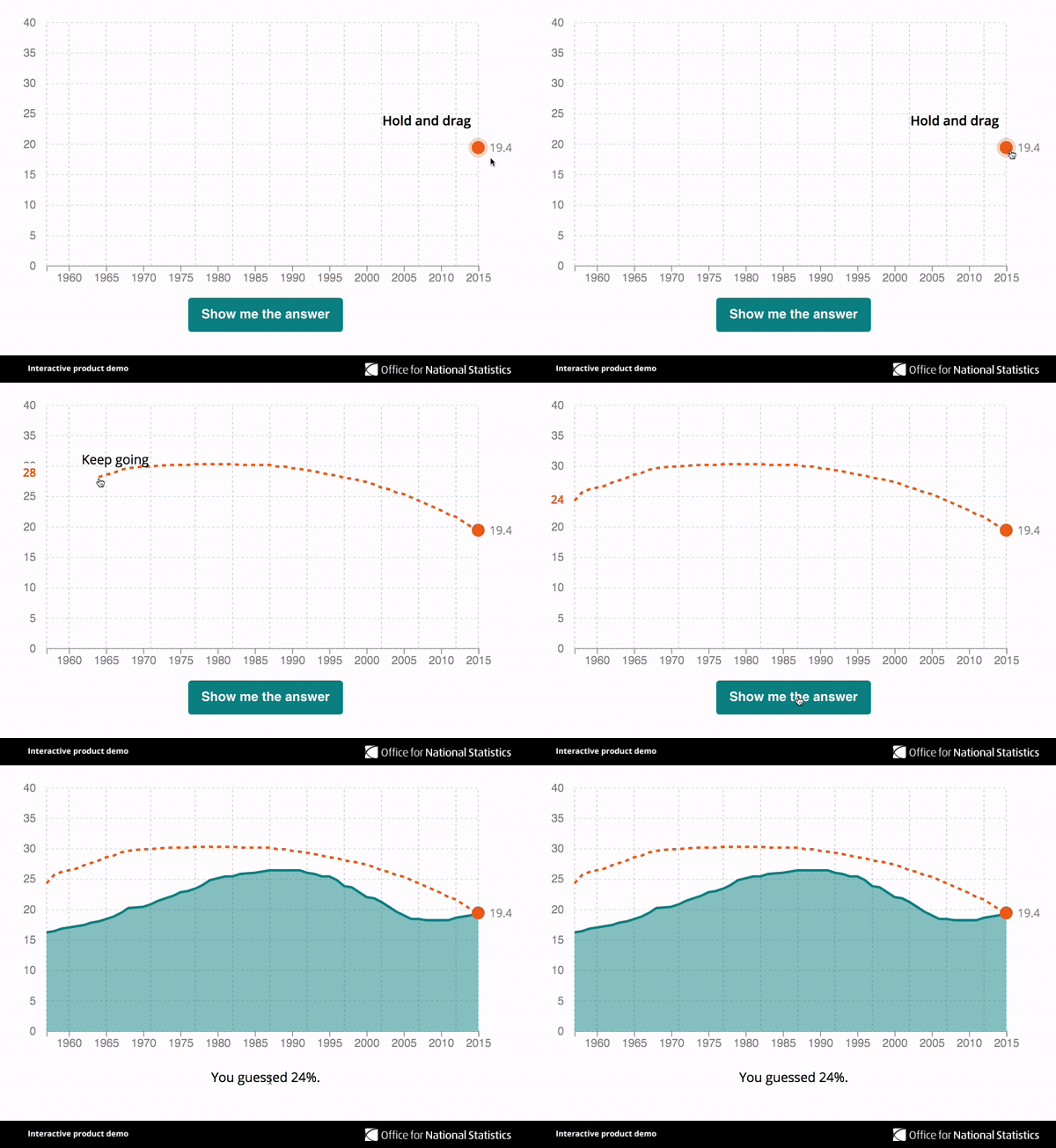
In October 1957 BBC Radio 4's Today programme went on the air for the first time. A lot has changed in the last 60 years: we are living much longer; attitudes to sex and marriage have become more relaxed; house prices have risen and the demographics of the country have changed. But do you know by how much?
We've teamed up with BBC News to use statistics to tell the story of the last 60 years.
Test your knowledge by drawing in the missing information on the charts below. The charts give you the latest figure – all you have to do is tap and drag the orange dot on each graph and draw the rest of the chart back to 1957, then use the "Show me the answer" button to see how you did.


How low were house prices in 1957?1
House prices have rocketed over the last few decades. But how modern is this phenomenon? Hold and drag the orange dot to trace the trend line back to 1957.
Average house prices, 1957 to 2017, UK
Embed code

How long could you expect to live in 1957?
Improvements in medical care and fewer people smoking mean that we are now living longer than ever. A baby boy born in the UK in 2014 could expect, on average, to live to 79; for baby girls born that year it was 83. But what do you think the average life expectancy was for a boy born in 1957? Can you draw the trend line back 60 years?
Life expectancy at birth, males, 1957 to 2014, UK
Embed code

Did many people divorce?
Marriage has dropped in popularity since 1957. That year 52 out of every 1,000 unmarried women tied the knot. In 2014 it was just 21 women out of every 1,000 unmarried women.
But what about divorce? How has it changed and what was the divorce rate in 1957? We've given you the latest figure for the number of women divorcing for every 1,000 married women. Tap on the orange marker and draw the trend line back.
Divorce and marriage rates, females, 1957 to 2014, England and Wales
Embed code

How many children were born outside of marriage?2
Today there are nearly as many children born to unmarried parents as those whose parents are married. Not so in 1957. But do you know what the percentage was back then? The orange marker is the latest number. Hold and drag to draw the trend line back.
Children born to unmarried parents, 1957 to 2016, England and Wales
Embed code

What percentage of people living in the UK were born abroad?3
This measure does not always mean what people think it means: it's not a count of foreigners living in the UK. For example Foreign Secretary Boris Johnson and the actress Emma Watson were both born abroad but would not be seen as foreigners by most people. The figures also include people born in Germany who are often children of British service people based out there.
Caveats aside though, this number has grown over the time Today has been on the air. The orange marker shows today's figure. But what was the trend and what was this number in the 1950s? Hold and drag to draw your line.
Embed code

What was the average age of a first-time mother in 1957?
The average age of a woman giving birth to her first child today is 29. This is higher than it was 60 years ago. Can you draw the line back to 1957? Hold and drag the orange marker to make your guess.
Embed code
Other Visual.ONS articles:
House prices: how much does one square metre cost in your area?
What affects an area’s healthy life expectancy?
Trends in births and deaths over the last century
If you like our Visual.ONS content and would like to see more, please sign up to our email alerts, selecting 'stories and infographics' under preferences.
Footnotes:
- The 2017 figure is an average of the monthly figures from January to August.
- Since 2009, data also include those born outside of civil partnerships.
- This chart is drawn from census data from 1951 to 2011. Census data are only collected every ten years, therefore estimates between these years are not official statistics.
